Before 1900

Photo By: John Thomson
Year Created: 1876
Subject's Expression: This photograph captured this time period perfectly. You can tell the two soldiers were not under any type of pose for the photo, which makes the reality of it all come alive. The body language speaks for itself, and makes the viewer wonder about their life story and what's going on in this period in history.
Keep it Simple: With something so simple, I think it can be the most powerful. Thomson kept the image simple, along with the subject matter. I think with the display of so little, provides the viewers with the opportunity to think so much more.
Rule of Thirds: Just like any well portrayed portrait, the principle of subject placement was successfully portrayed here. The main subject here is of the two soldiers, and they are proportionally placed right in the center.
I choose this image because I found the picture to be curious. I began to think about what was going on in this specific period of time and where these soldiers were going. Or even if they are soldiers, or slaves. A good photograph makes the audience develop questions.
1901-1950
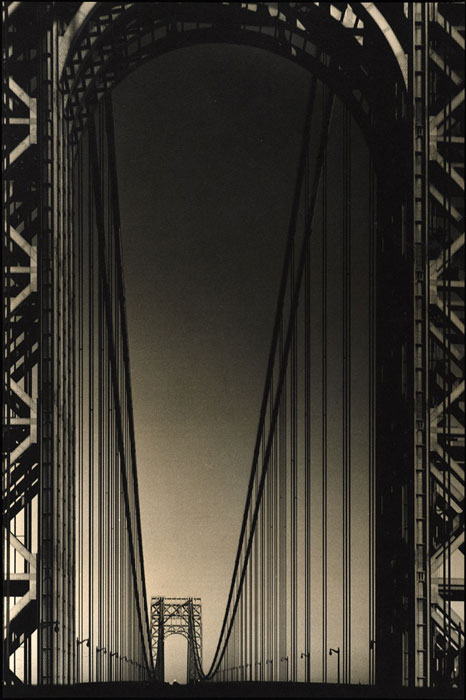
Photo By: Margaret Bourke-White
Year Created: 1934
Quality of Light: The contrast of the black and white tones, along with sepia are very eye catching and flatters the subject matter. I enjoy how the deeper my eye is drawn into the photo, the lighter it gets. The quality of light in this photograph is very appealing, and engages the use of line along with the depth of field.
Use of Line: The use of line in this photograph is spectacular. The eye is immediately drawn to the depth of the bridge itself. The positioning of the camera angle allows the viewer to have a slightly different view from the bridge and because of the articulate horizontal and vertical lines, it is eye catching. There is even beauty in architecture if you perceive it just right.
Depth of Field: Because of the direction of line, and the entire image remaining in focus the great depth of field is an obvious principle. It was appealing to see how the entire architecture was captured. I enjoyed how I can easily see the first pillars, and the clearly depicted geometric shapes, to the end of the structure. I could clearly imagine how elongated the bridge is.
I choose this image initially because of the color, not quite black and white nor sepia. It was unique. I've always enjoyed Margaret Bourke-White and her eye for architectural photography- she truly see's the beauty and uniqueness in something so ordinary and obscure.
1951-Today

Year Created: 2001
Obvious Main Subject: The ruin and the flag are both outlined in this photograph. The subject matter is clearly displayed about 1/4 of the image area. Because of the use of this principle, the impact is greater.
Contrast Appropriate: The contrast is very dark and grey, with the only color coming from the American flag. The darkness combined with the only color coming from the flag contributes to a somber feel. So powerful and moving with the use of a contrasting color was unique.
What in the image helped to create the feeling?: September 11th was a powerful and emotionally riveting day. Certain images like these strike certain emotions. For me personally, I had feelings of remembrance and hope. The American flag acting as a symbol, and the way that Nachtwey captured the shot, our eyes are immediately drawn to that powerful display.
I chose this picture originally because I was attracted to many of James Nachtwey's photographs. I think he has a very different and pristine way of capturing his photographs. Almost all of them include the artistic and compositional principles that make up a good photograph. But this photograph especially caught my eye, the angle coming from the window was creative. It was framed perfectly, and the contrasting colors really symbolized the American Flag in a scene of destruction.
No comments:
Post a Comment